LIMS Data Analytics and Visualization tools graphically present data from your LIMS, and potentially other applications, to provide powerful business intelligence for your laboratory and organization. Like all LIMS, Matrix Gemini LIMS uses a relational database (usually Microsoft SQL or Oracle) to store the LIMS data. Data Analytics tools provide another way to present this data. Using their ability to aggregate information and present it in the form of simple-to-interpret graphs, tables, and diagrams, these tools allow key LIMS information to be represented in a way that facilitates the decision-making process.
Typical LIMS Data Analytics and Visualization tools
There are many data analytics tools on the market, including Zoho, PowerBI, Qlik, and Tableau. They connect to one (or more) data sources (including databases and/or spreadsheets) to extract the required data. Any of these tools can be used for LIMS Data Analytics corporate IT policy; previous experience or the preferences of your data science group may dictate which you use.
Data Analytics tools allow read-only access to data from multiple sources. An organization may have deployed a data warehouse to hold a subset of key data from across the business. A well-implemented data analytics tool will be able to access this data, as well as the full set of data available in the LIMS, to provide exceptional insights into the operation of the laboratory.
Know your LIMS Data
The hardest part of working with analytics tools is understanding how to extract the right data from the right tables in the right databases. The database tables for any particular LIMS are of a standard format. A document describing those table structures will usually be available from the vendor. If not, it is still important to understand the structure of the data in the database and the relationships between the various database tables. Knowing this will make using the analytics tools simpler and ensure that the correct data is extracted.
Accessing your LIMS Data Analytics Application
Matrix Gemini LIMS provides a highly configurable user interface, so it is no surprise that your preferred data analytics tool can be integrated and made available from any workflow screen. Access to the tool and the data can be controlled on a user-by-user basis depending on their authority levels.
For example, in this article, we have used PowerBI as data analytics software.
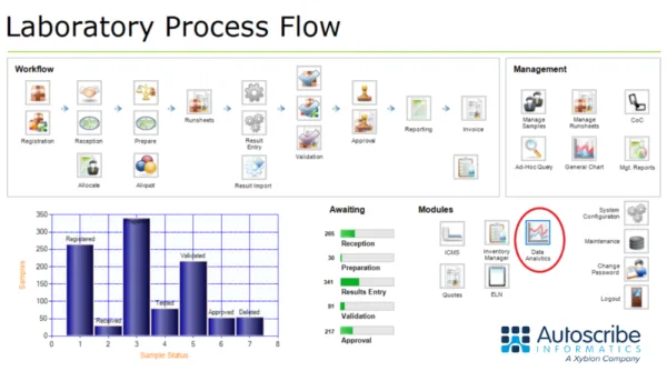
Typical Charts, Graphs, Maps, and Tables—Some Worked Examples
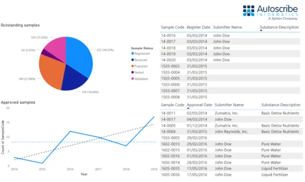
Almost any data can be pulled from the database(s). A typical example would be to show the status of samples in the laboratory (registered, received, prepared, tested, validated) at a point in time using a pie chart. Management charts might include a graphical representation of key data, such as the throughput of samples per year.
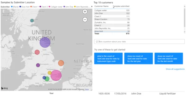
Built-in mapping functions can plot data to zip/post codes. This is useful where you want to highlight the source location of samples, e.g., to map positive results of a test to a location. This can quickly show data as geographic clusters and can be useful in investigative projects. Since PowerBI is being used here, the results are mapped onto a Bing map. Other analytics tools use other mapping applications, but the results would be similar. PowerBI also includes the ability to type in a question about the data, e.g., ‘Show me the count of tests performed by result entry date.’ Power BI interprets this question, pulls the data, and shows it in a relevant format.
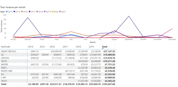
In a commercial laboratory, costs may be associated with each test. This allows analytics tools to highlight which tests create the most revenue, rather than just the number of times each specific test is performed. These can also be split by month/year to show, for example, the popularity and profitability of each test type over time. Overall profitability per instrument, per analyst, per site and so forth is also possible.
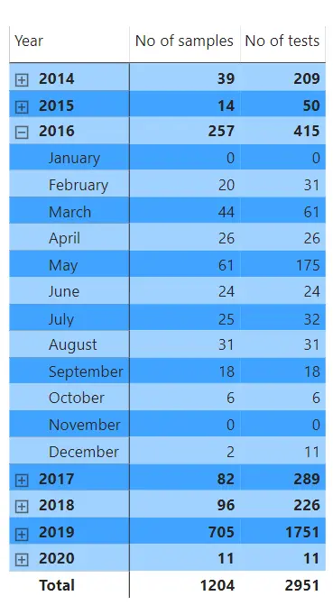
Data can also be shown as simple tables. In this example, the number of samples and the number of tests per year are shown. Note how users can interact with the table by clicking on the year to expand it to show a more detailed monthly view. Users can interact with all graphs, charts, and tables in this way. This can trigger secondary graphs, charts, and tables to update on the dashboard, as you would intuitively expect, ensuring all data in view is relevant.
Why use LIMS Data Analytics Tools
Data analytics tools empower laboratories to unlock the full value of the information stored within their LIMS. By visualizing and analyzing data in real time, laboratories can:
- Identify bottlenecks that cause performance inefficiencies.
- Highlight opportunities for process improvement and resource optimization.
- Investigate and determine root causes of quality or operational issues.
- Correlate seemingly unrelated data such as geographical patterns and test results to reveal new insights.
- Support data-driven decision-making across scientific, operational, and business domains.
Many organizations already use data analytics across their broader business operations to enhance visibility and efficiency. Within the laboratory, these same capabilities deliver even greater value, enabling continuous improvement, regulatory readiness, and performance optimization.
Whether you require management reports for monthly review meetings or data to drive quality improvement initiatives, LIMS-integrated analytics and visualization tools provide a defensible, evidence-based framework for informed decision-making and strategic planning.
Connecting LIMS Data Analytics Tools
In a commercial laboratory environment, every test carries an associated cost and, in many cases, a measurable revenue impact. Integrating data analytics with your LIMS allows laboratories to go beyond simple activity tracking to gain deeper financial and operational insights. For instance, analytics tools can identify which tests generate the highest revenue, not just how frequently they are performed. This information can then be segmented by month or year to reveal trends in test popularity and profitability over time. Laboratories can also assess overall performance by instrument, analyst, department, or site, providing a clear understanding of where efficiencies can be gained and where resources are best allocated.
Beyond financial analysis, data visualization capabilities enable users to view operational metrics in intuitive formats such as graphs, charts, and interactive tables. For example, users can analyze the number of samples and tests processed each year, then simply click on a particular year to expand the view and display monthly data. Interactive dashboards automatically update related charts and tables in real time, ensuring that every data point remains contextually relevant and easy to explore. This level of interactivity empowers laboratory managers and analysts to make faster, evidence-based decisions and to present complex data in clear, actionable ways.
Ultimately, LIMS-integrated data analytics tools unlock the full potential of laboratory data. They help organizations identify bottlenecks, optimize processes, and uncover meaningful correlations across scientific and operational data. In highly regulated or high-throughput environments, this analytical visibility supports continuous improvement, enhances compliance, and drives sustained performance growth. Whether you’re generating monthly management reports, monitoring efficiency, or justifying capital investments, analytics within a LIMS provide a defensible, evidence-based foundation for strategic decision-making.
At Instem, we understand that laboratories need more than data—they need insights that drive results. That’s why solutions such as Matrix Gemini LIMS are designed to integrate seamlessly with advanced analytics and visualization platforms, enabling laboratories to connect, explore, and act on their data in meaningful ways.
If you would like to explore how data analytics can strengthen your laboratory’s decision-making, contact us today. Our team would be pleased to demonstrate how to connect analytics tools directly to your LIMS workflows and help you get started on transforming your data into actionable intelligence.